Upside Commerce, Android shopping app
Redesign of location and affinity based shopping app for Android. Material Design and card concepts featured.

This redesign for Upside Commerce was a rapid iteration, following a rush to market release. The original app concept was designed for Windows Phone and was over 5 years old, not only that, the designs were platform agnostic and dark themed. The redesign needed to be light and breathable, and utilize platform relevant design patterns.
The problem: Approach re-design from persona based research - making sure new features and previously existing features were easily discoverable for new and existing users.
The process: First was the task of developing four strong persona's from data consisting of field testing friends and family users, and cross referencing the original marketing personas. Early sketches were low-fidelity physical sketches to inform priority of designs for mobile devs.

High Fidelity Design Process: The next step was designing an icon set with cross-platform appeal, that would fit in the existing design language and be easy to discover in a more icon heavy design. Using Material Design concepts such as card, drawers and floating action buttons, the android designs were flushed out to have a more platform friendly design, as well as more commonly occurring actions and animations.

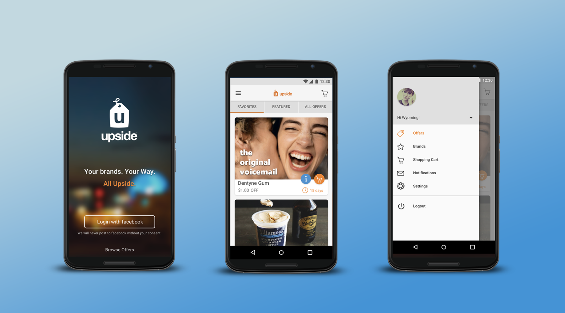
Screen 1: Login screen simplified and modernized.
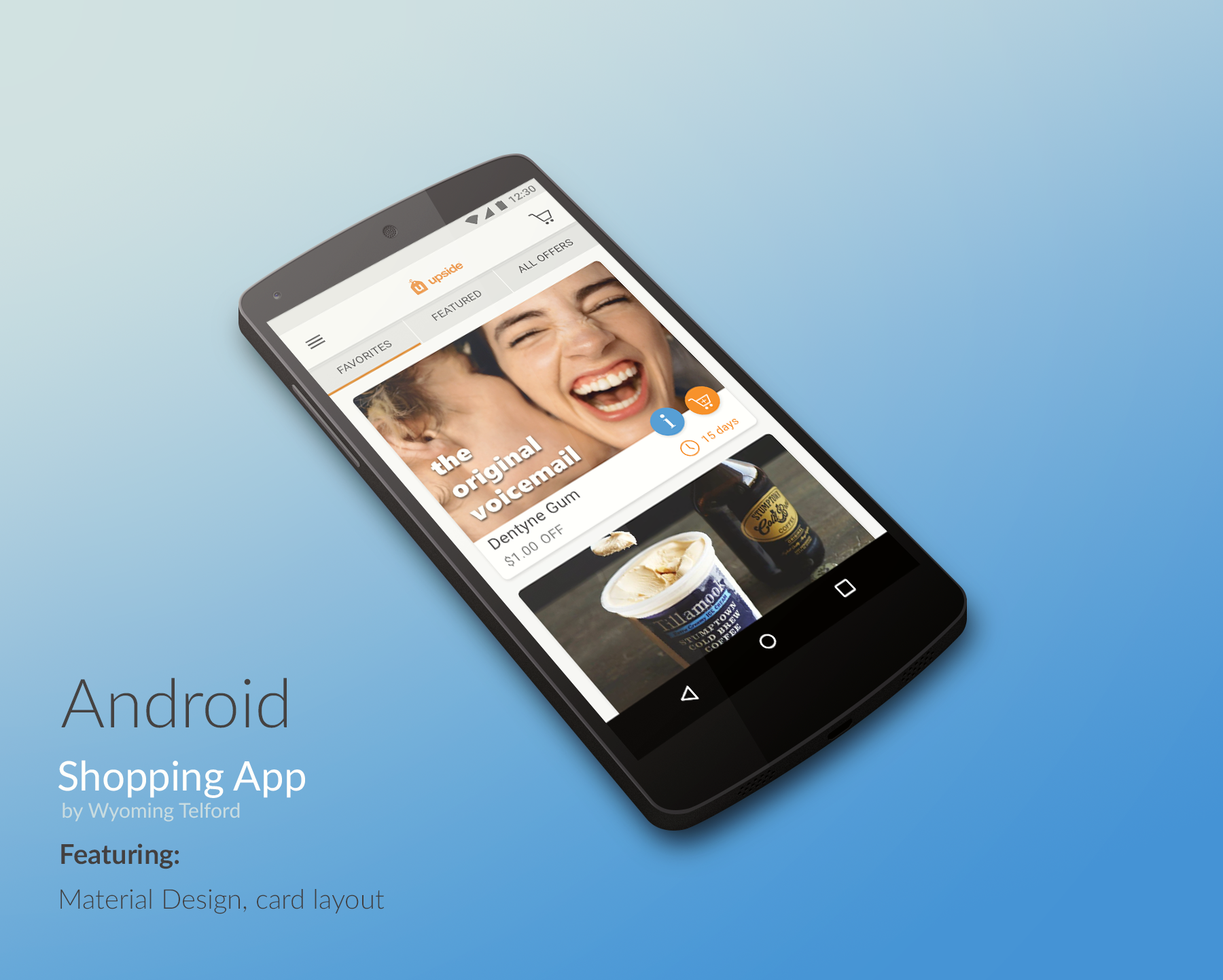
Screen 2: Default screen is the offer feed. Brands with current offers that are favorites of the user are displayed prominently in card format.
Screen 3: Example of new drawer based navigation. The shopping cart is added to top nav for easy access outside of drawer navigation.

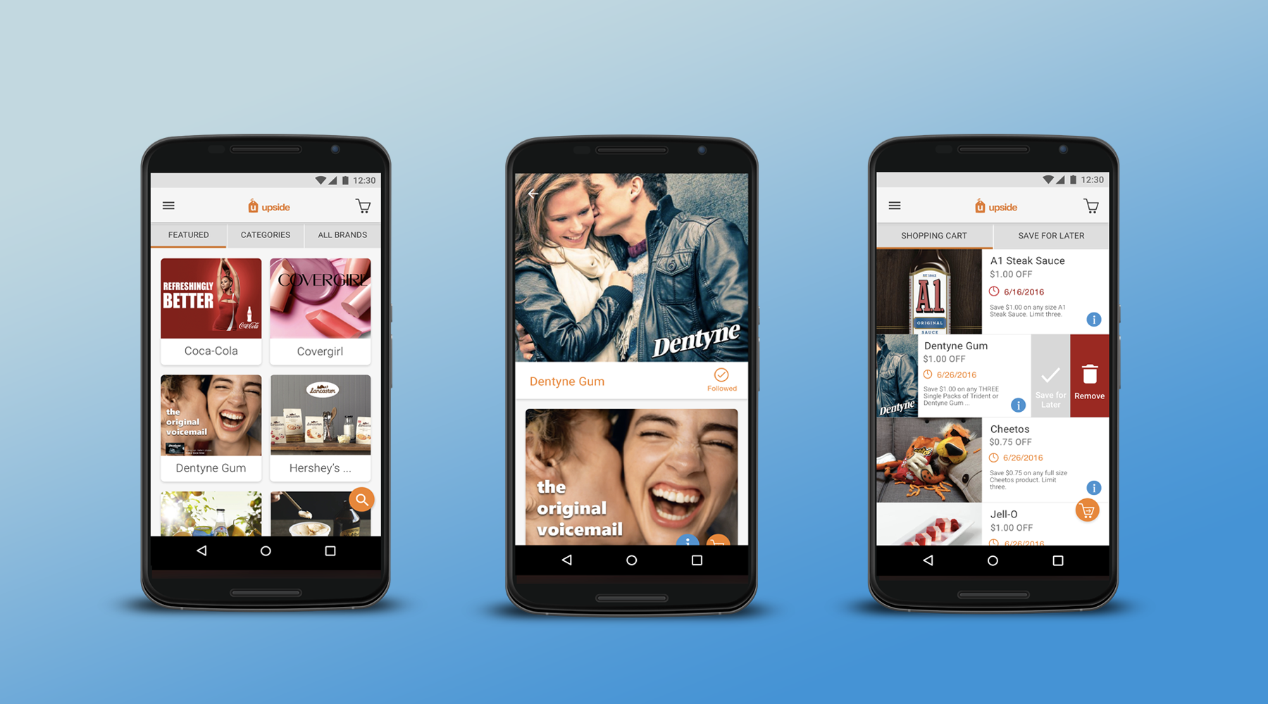
Screen 4: Brand list-view for offer shopping. Brands are sortable by Featured, Category or All.
Screen 5: When a user selects a brand, they land on a brand detail view which shows current offers and allows users to follow the brand for easy discovery in the Offer Feed later.
Screen 6: Shopping cart view. When a user selects the shopping cart, there is a tab filter for shopping cart items or save for later. From both screens users can choose to add to cart/save for later, or remove the offer from the cart. The floating action checkout button initiates the checkout flow.

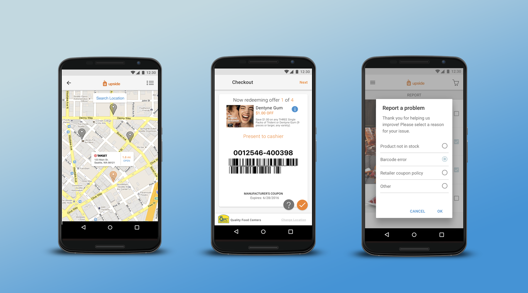
Screen 7: Map view/retail picker. When the user begins checkout, the option to choose a retailer is available as a list or map view.
Screen 8: Redeem offers with barcodes at point of sale systems. Barcode must be easily to scan by cashier, and the logo of the retailer must be prominent on the page.
Screen 9: Report a problem features a list of recently redeemed offers. User selects an item and chooses a reason from the selection list. Each item can be reported individually with it's own reason.
Interactive Marvel Prototype
Note: Play button starts a click-through experience that mimics user flows through the app. It is NOT a video.
Marvel Prototype for high level walkthrough.